Research Overview
Summary
The CATA project seeks to systematically evaluate and improve these accessibility features within transportation applications. By conducting a thorough analysis of existing platforms, the project aims to identify common pitfalls and provide actionable recommendations that can lead to significant enhancements in user experience. This initiative involves collaborative efforts from a diverse team of UX researchers, accessibility experts, and software developers, all committed to the goal of creating more inclusive digital environments.
RESEARCH OVERVIEW
COLLABORATIONS
Project oversight…
Michele Jackson via Michigan State University
In collaboration with…
Tony Costantini
Tiara Lavender-Stinson
Joe Ambrose
project scope
audit overview
Click here for the CATA website.
As urban populations expand and digital interactions become increasingly integral to everyday life, ensuring that these systems are usable for all individuals—regardless of ability or disability—has never been more critical.
In recent years, there has been an increasing emphasis on inclusivity in design, driven by legal mandates such as the Americans with Disabilities Act (ADA) and the Web Content Accessibility Guidelines (WCAG). However, despite these guidelines, many existing digital platforms fail to adequately serve individuals with disabilities. Issues such as lack of real-time updates, poor navigation, and inadequate error prevention mechanisms have been identified as barriers that hinder user experience, particularly for those relying on assistive technologies.
Background
The project’s methodology involves both qualitative and quantitative approaches, including usability testing with a focus on individuals with disabilities. This user-centered design approach not only emphasizes the importance of user feedback but also aims to create a better understanding of the diverse needs of the community. By engaging with users directly, CATA aims to gather insights that will inform design improvements and foster a more accessible and user-friendly digital ecosystem.
Service Profiles
The demographic research conducted on riders utilizing the Capital Area Transportation Authority (CATA) in the East Lansing area reveals that a significant portion of the ridership consists of young adults, particularly students from local educational institutions. Many of these riders travel short distances between their homes, workplaces, and campuses. This trend underscores the demand for efficient and accessible public transportation services tailored to the unique needs of this demographic. Understanding these user characteristics is crucial for informing the design and functionality of CATA’s digital platforms, ensuring they effectively meet the requirements of this vibrant community.
Error Documentation, Diagnostics & Error Recovery
The design should incorporate error indicators that are expressed in clear, understandable language to help users identify the problem and easily find a solution. Currently, there are no error indicators throughout the page, and no obvious next steps for any part of the process. Help documentation is only accessible if users leave their current page. It is recommended to display error codes in concise, plain language. Users should also be presented with alternative options when unexpected factors affect their search outcomes, ensuring they can easily recover from errors.
Visual Data
Help & Documentation
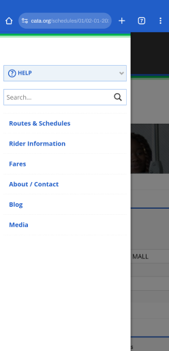
The design should minimize the need for explanations and documentation, but when required, it must clearly guide users on how to complete their tasks. Currently, auditory accessibility features are only available in a new tab, which makes it impossible for users to listen and view the content simultaneously. New users, in particular, may find navigating the page quite challenging without sufficient assistance. It is recommended that text-to-speech and similar accessibility features be integrated directly into the page, eliminating the need for off-page navigation. Additionally, help guides and tutorials should be prominently displayed to enhance user understanding.
Visual Data

Heuristic Analysis
Evaluation Process
Evaluation focused on assessing the user experience and usability of its digital platforms through a comprehensive analysis of various design principles. Each principle was examined for its effectiveness in facilitating user interaction and satisfaction. Key areas of evaluation included the visibility of system status, match between system and real world, user control and freedom, consistency and standards, error prevention, recognition rather than recall, flexibility and efficiency of use, aesthetic and minimalist design, error recognition and recovery, and help documentation.
Throughout the evaluation, specific issues were identified, such as the absence of real-time updates, unclear language, cumbersome navigation processes, and inadequate error indicators. Recommendations were made to enhance user experience, including implementing real-time notifications, simplifying language, improving the layout and accessibility of maps, and providing inline help features.
The evaluation emphasized the importance of catering to the diverse needs of CATA‘s ridership, which primarily consists of young adults and students. By integrating feedback and addressing the identified issues, the evaluation process aimed to inform and guide the design improvements for CATA‘s services, ensuring they are user-friendly and responsive to the commuting habits of their riders. Overall, the evaluation sought to create a more intuitive and efficient public transit experience for all users.
Heuristic Analysis
insights I
Visibility of System Status
The design should ensure users are kept informed about system status by providing timely and relevant feedback. Currently, real-time updates on schedule changes and delays are missing, which forces users to navigate multiple pages to find essential information. Additionally, there are limited action indicators to guide users to their next step. It is recommended to implement real-time updates and notifications, add clear call-to-action buttons such as confirmation and submission options, and use color-coded indicators for route statuses.
Visual Data
Match Between System & Real World
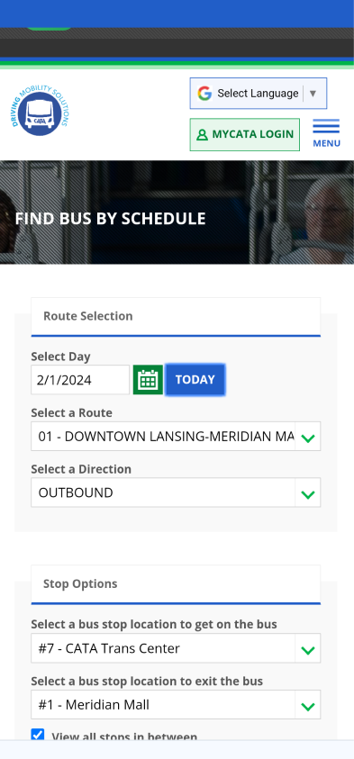
The design should use language, phrases, and concepts that are familiar and natural to users. Currently, transit and location-specific time formats are used, with no options for users to modify these formats to match their regional preferences. Additionally, transit-specific terms like “inbound” and “outbound” may be difficult for new users to understand or translate. It is recommended to provide users with the ability to easily switch between time formats and present information in a simplified manner that can be understood without requiring prior knowledge.
Visual Data
User Control & Freedom
The design should allow users to make mistakes and offer clearly marked ways to easily abandon unwanted actions. Currently, there is a lack of filters and custom options for viewing schedules and features. Users cannot set personalized default settings for days, times, or formats. Additionally, there are no options to save and bookmark routes or set recurring reminders. It is recommended that the route selection chart only display information relevant to the selected route, and that users are provided with more opportunities to personalize display settings and default options.
Visual Data
Consistency & Standards
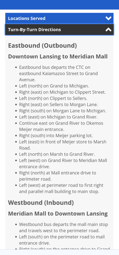
The design should ensure that users can generalize words, situations, and actions across pages, following industry standards. Currently, too much information is presented at once, and touch features, such as selecting a date on the calendar, lack visual indicators of success. There are also extreme inconsistencies among components, buttons, and colors, and certain elements need to be rearranged. It is recommended that colors, components, and effects remain consistent throughout the interface. Alerts should appear at the top of the page, and additional visual elements, such as universal symbols, should be used to enhance clarity.
Visual Data
Heuristic Analysis
insights II
Error Prevention
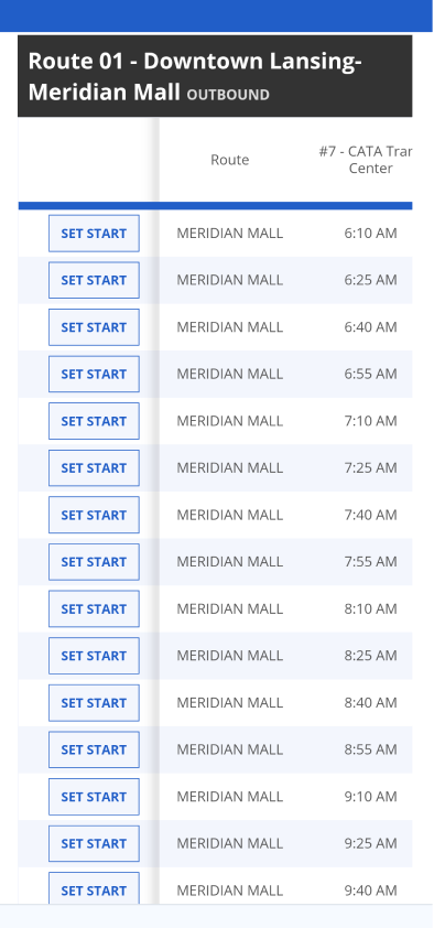
The design should prioritize providing clear solutions for error resolution while minimizing the chances of errors occurring. Currently, users need to leave the page to find information that helps them select the correct route. Features such as the time selection chart are ambiguous, causing new users to struggle or misunderstand their purpose. It is recommended to display pertinent route updates and other important information on the same page. Error messages and indicators should be included to guide users, and prompts should direct users to the next step in the process.
Visual Data
Recognition vs. Recall
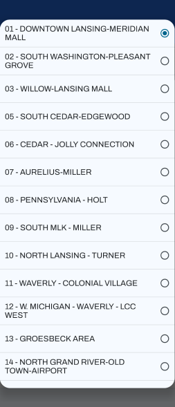
The design should minimize the user’s memory load by making visual elements and components easily accessible for smooth navigation. Currently, there are no suggestions based on recent searches or commonly used routes. Information about routes is only available in a new tab, forcing users to remember details from other pages to make decisions. It is recommended to allow users to input route numbers or specific information to quickly find familiar routes. Users should also have the option to choose from frequent and recent stops. A “like” and “save route” feature would further enhance user experience.
Visual Data
Flexibility & Efficiency of Use
The design should cater to both new and experienced users, adapting to their preferences and behaviors for a more efficient experience. Currently, the process for selecting start and end times is cumbersome and confusing. The mobile interface lacks useful gestures, and formatting is often unreadable or fails usability standards. There are also significant accessibility issues. It is recommended to incorporate touch gestures for mobile users. The webpage content should adapt to frequent visitors’ behaviors while providing clear, straightforward navigation for beginners.
Visual Data
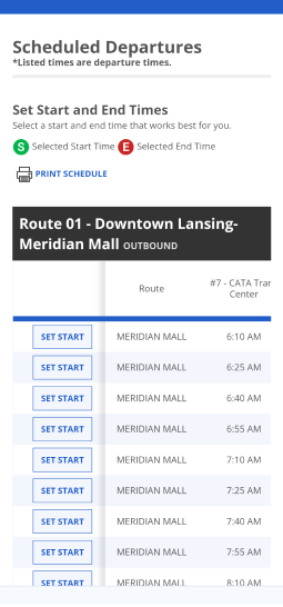
Aesthetic & Minimalist Design
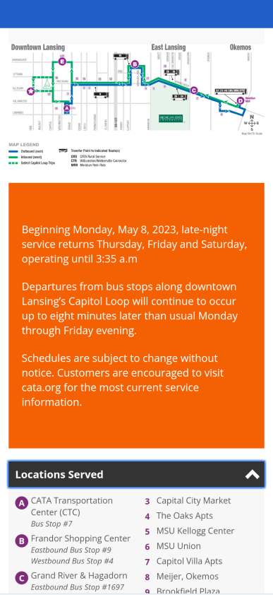
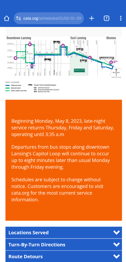
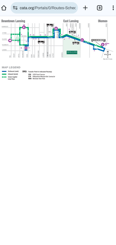
The design should present an aesthetic that caters to both new and experienced users while being simple and efficient. Currently, on-site maps are inaccessible or unreadable, and the route map and visual key are not grouped together. There is a lack of visual elements or icons, and colors, components, and selection highlights are inconsistent across sections. It is recommended to move the visual icon key directly underneath the route map. Only display filtered information when relevant selections are made. Additionally, maps should be adjustable in size and interface for better usability.
Visual Data
